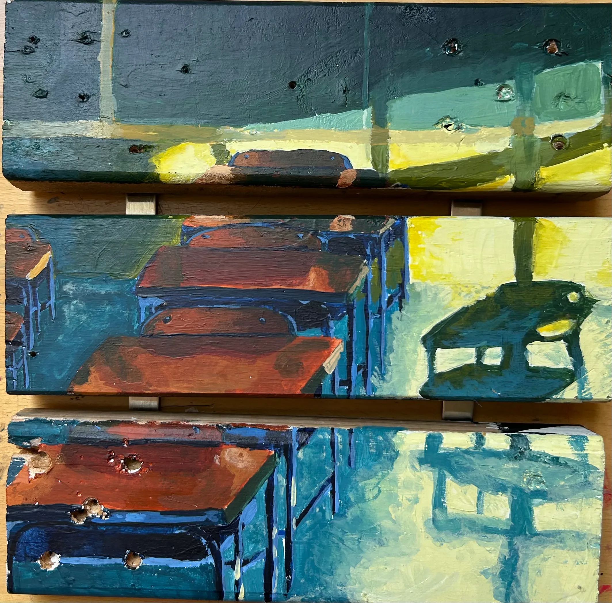
View of a Classroom
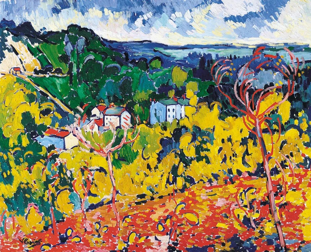
This painting was inspired by the work of Maurice de Vlaminck, specifically his painting Bougival. I loved the way he used color to capture emotion, bringing in hues of blues and deeply saturated oranges to capture an overwhelming sense of nostalgia. In Bougival, Vlaminck paints a beautiful hilly scene littered with trees and houses. I wanted to reflect the idea that the classroom is now where time is spent. Instead of being raised outside, I grew up within a school. In Bougival the scene is open and soaring with visible clouds and shoreline, whereas in the classroom, the space feels enclosed and tight, mimicking the way that life is structured around education.
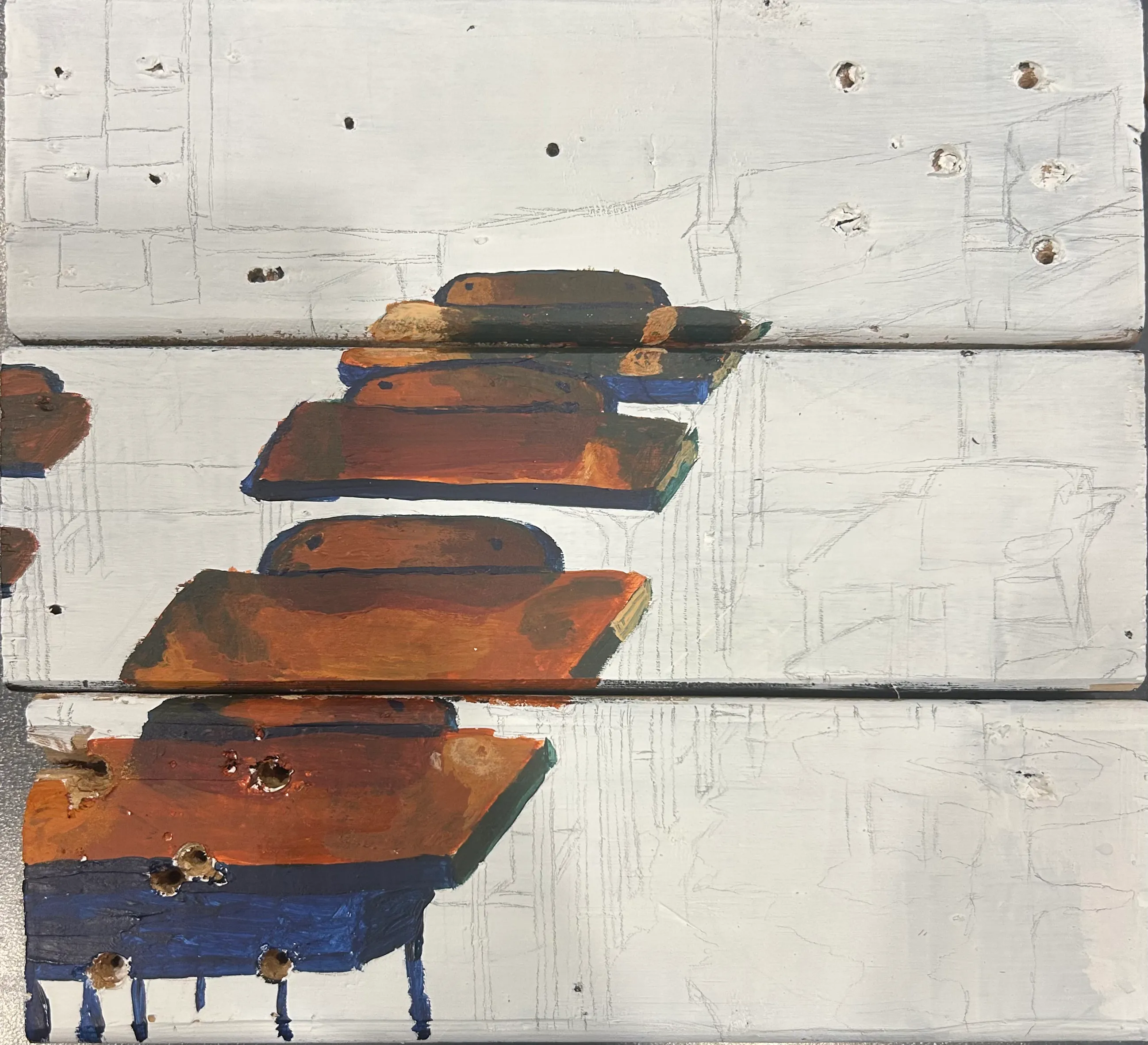
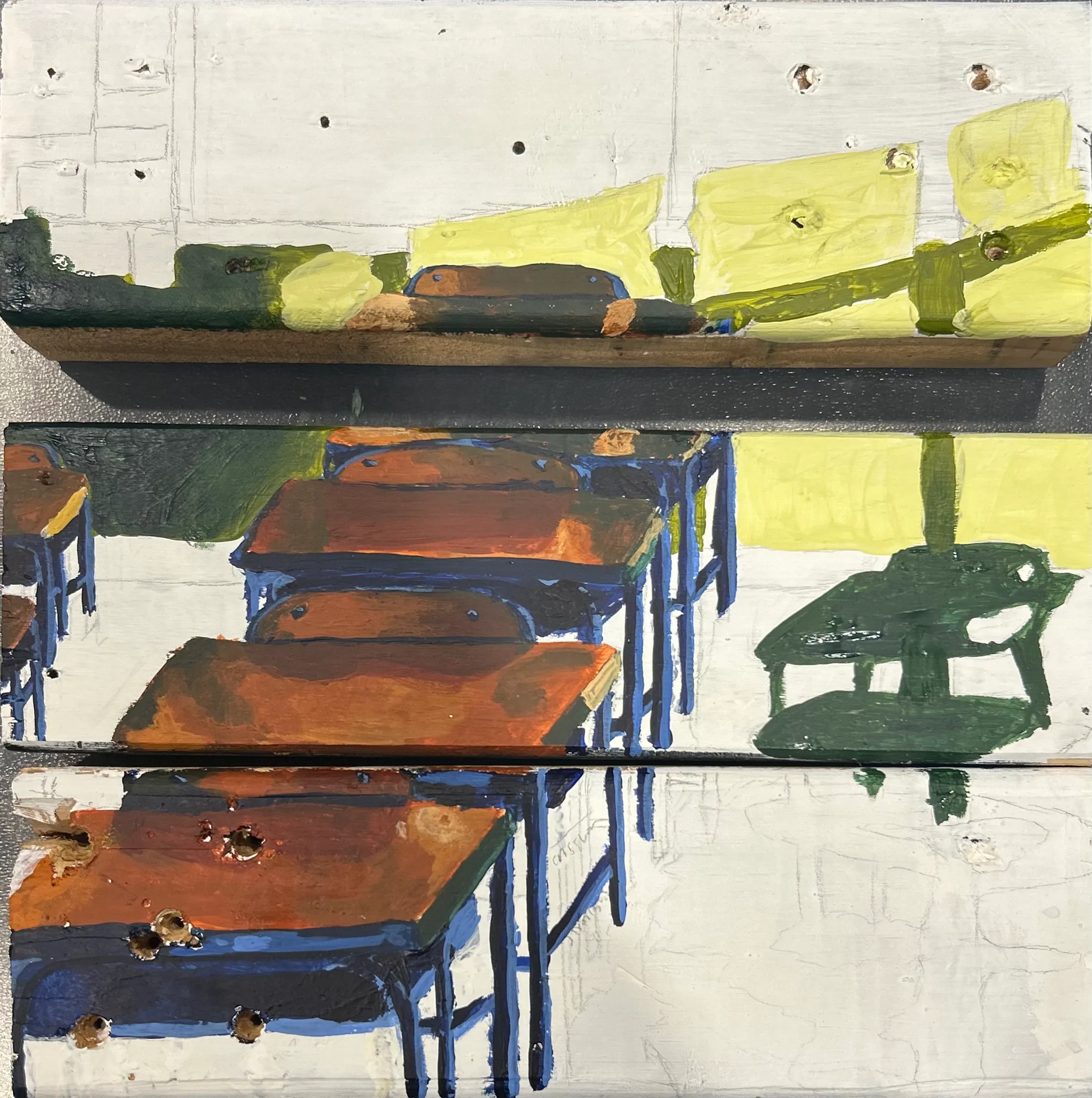
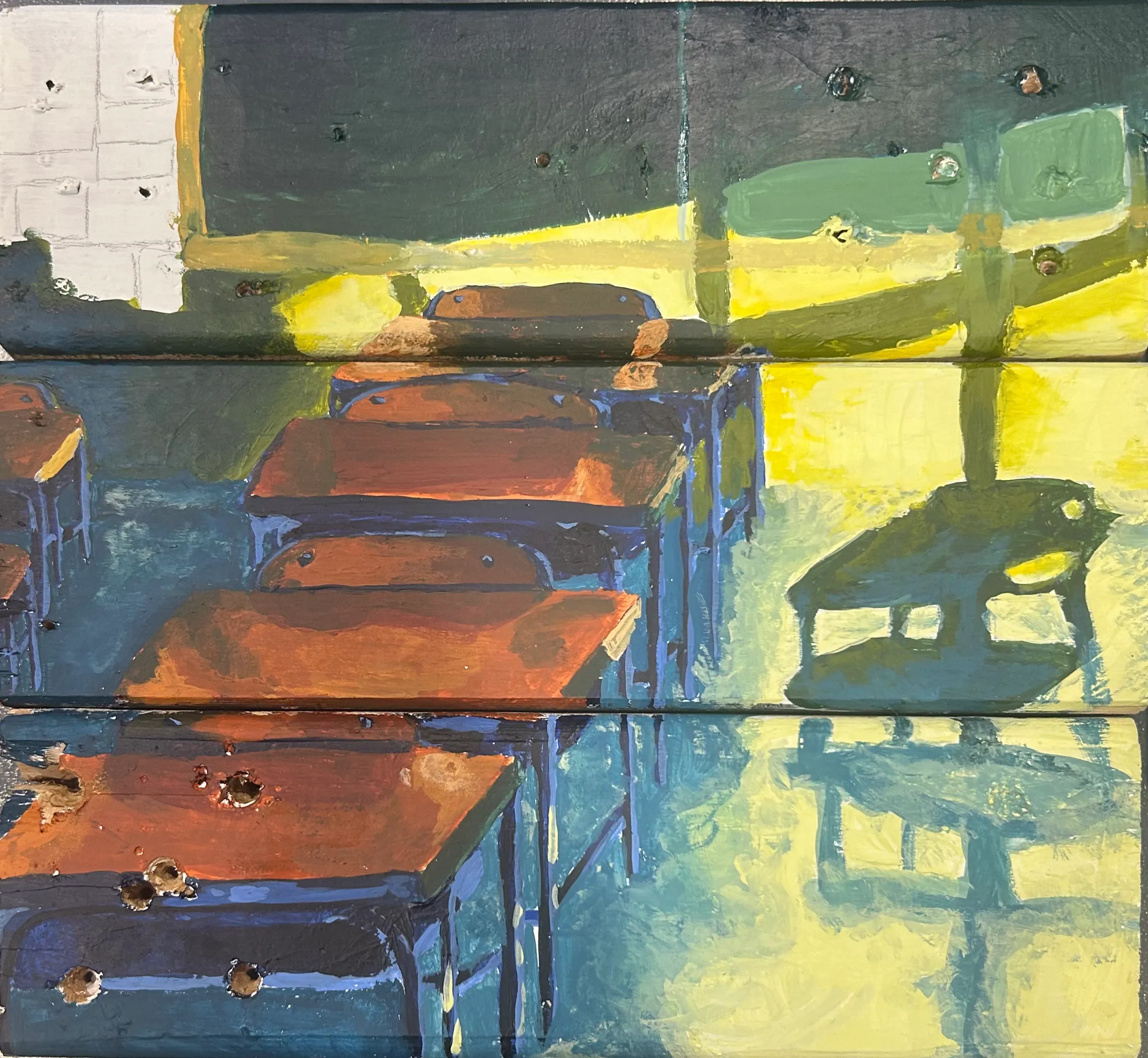
Technical Process
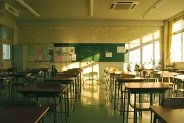
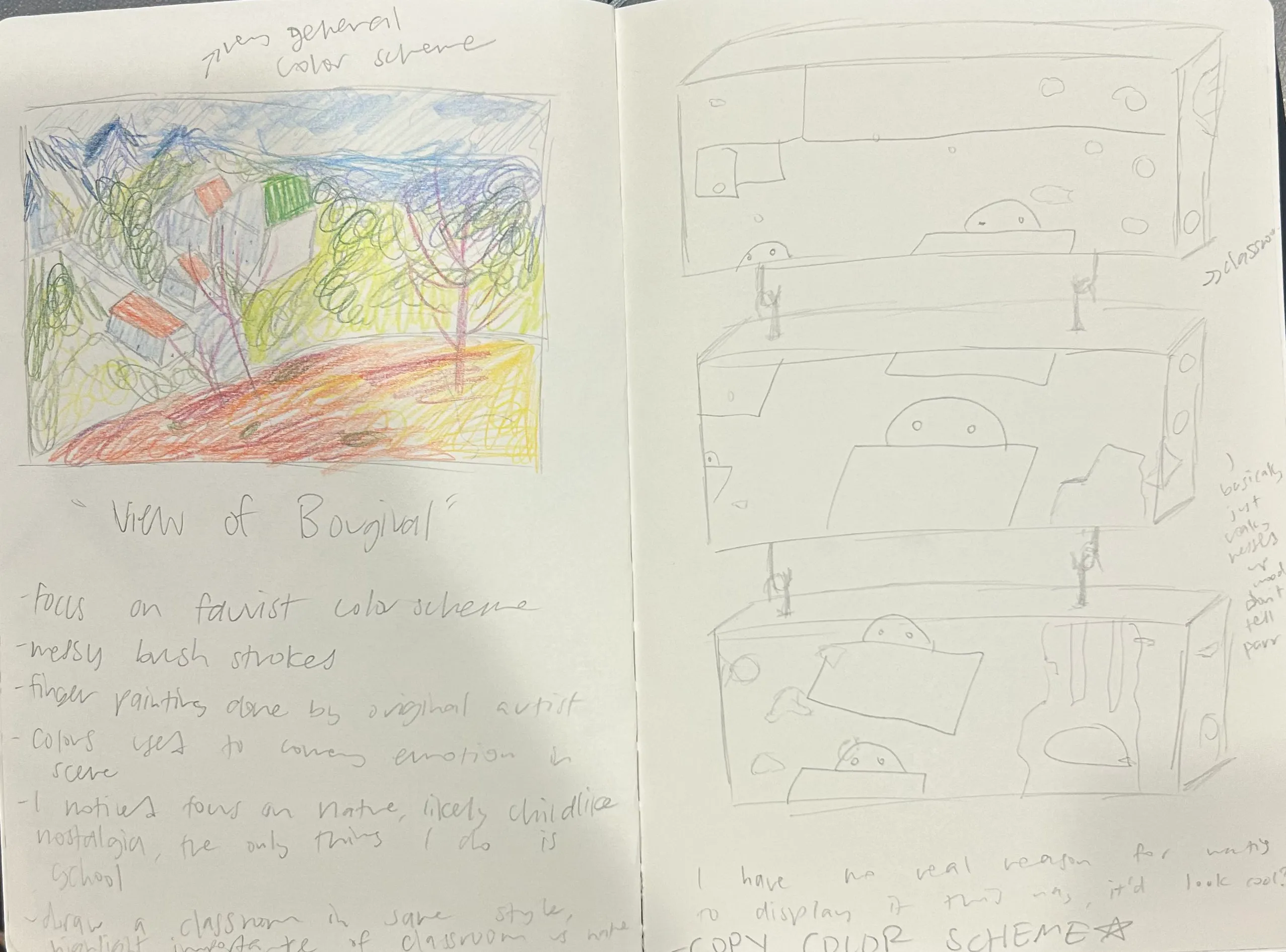
To start this project, I knew I wanted some roughed up wood to paint on, so I ventured into the scene shop (sorry Mr. Parr). I found 3 little pieces of wood littered with screw holes, caked with old paint, and muddied with different colors. It was obvious that they had been used many times before. I painted the tops white with a few thick coats of acrylic paint, and I began to sketch my design. I knew from the moment I saw Bougival, that I wanted to paint a classroom, so I immediately started sketching desks, blackboards, and a typical classroom scene. I went in with some highly saturated colors, and used the painting beside my reference image in order to get the colors as close as possible. I painted by color blocking the shadows and using my fingers to blend the paint. Maurice de Vlaminck often painted directly with his fingers onto the canvas, and I tried to mimic that as well. I did this mostly on the ground where the blue fades into yellow, and it honestly worked very well. I filled in the background, using yellows for highlights, deep blues for shadows, and bits of red in my midtones. Once I was finished painting, I had the idea to install this piece with gaps in between the blocks of wood. I thought that having shadows on the pieces would bring more emphasis to the color, and after testing it out I was right. I screwed in some metal seperater plates and got ready to hang my piece.
Elements and Principles
The main element of art that I used in this piece was color, as that's the aspect I "stole" from the gallery piece I found, and the main focus of the piece. As for principles, I utilized mostly movement as the sunlight makes the scene move from the window, to the desks, to the boards in the background, and across the entire scene.
Critique 1:
"Try to make the legs of the desks more defined, and focus on the perspective of the image."
-Nicolas
Critique 2:
"What if you hang the boards with some space in between to make the colors pop more? I think it'd look really cool"
-Monika
Critique 3:
"I love the way the scene flows together, with the sunlight into the desks and onto the board. I think you do a very good job of using color to get that done. What are your plans for the back board?"
-Ms. Johnson
Overall Reflection
Materials: Acrylic on recycled wood, meant to reflect people stuck in schools wishing they were in nature
Processes: Typical painting with brushes, sanded wood, fingers to blend and give impressionist look
Size: 12 in x 12 in
Image Citation: Maurice de Vlamnick's Bougival, Fauvist style painting, Traditional classrooms